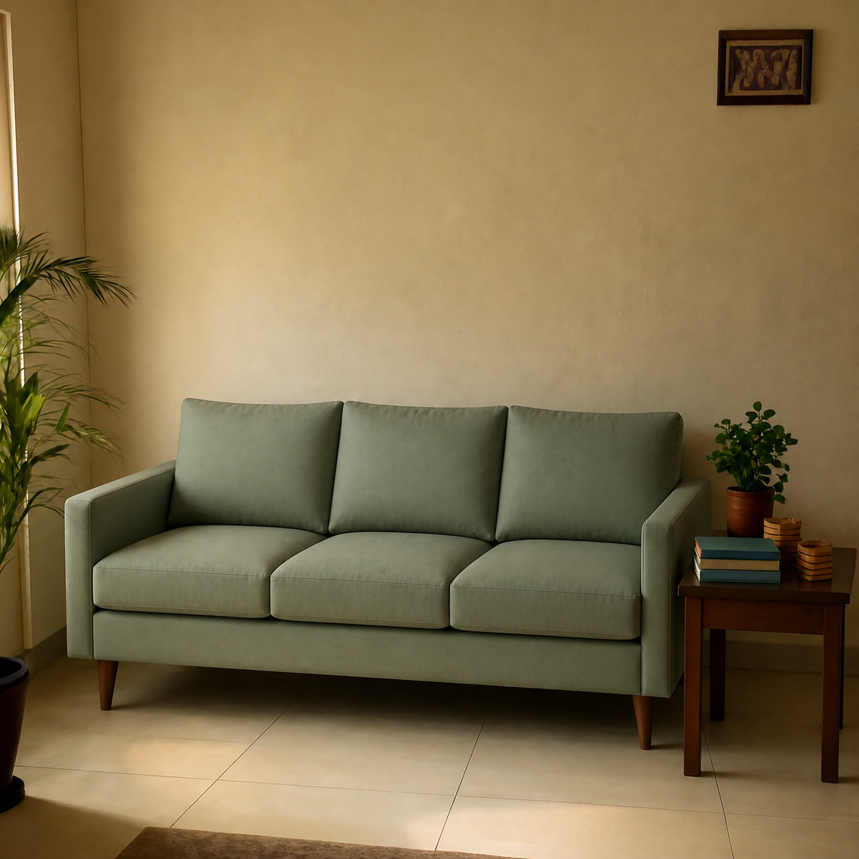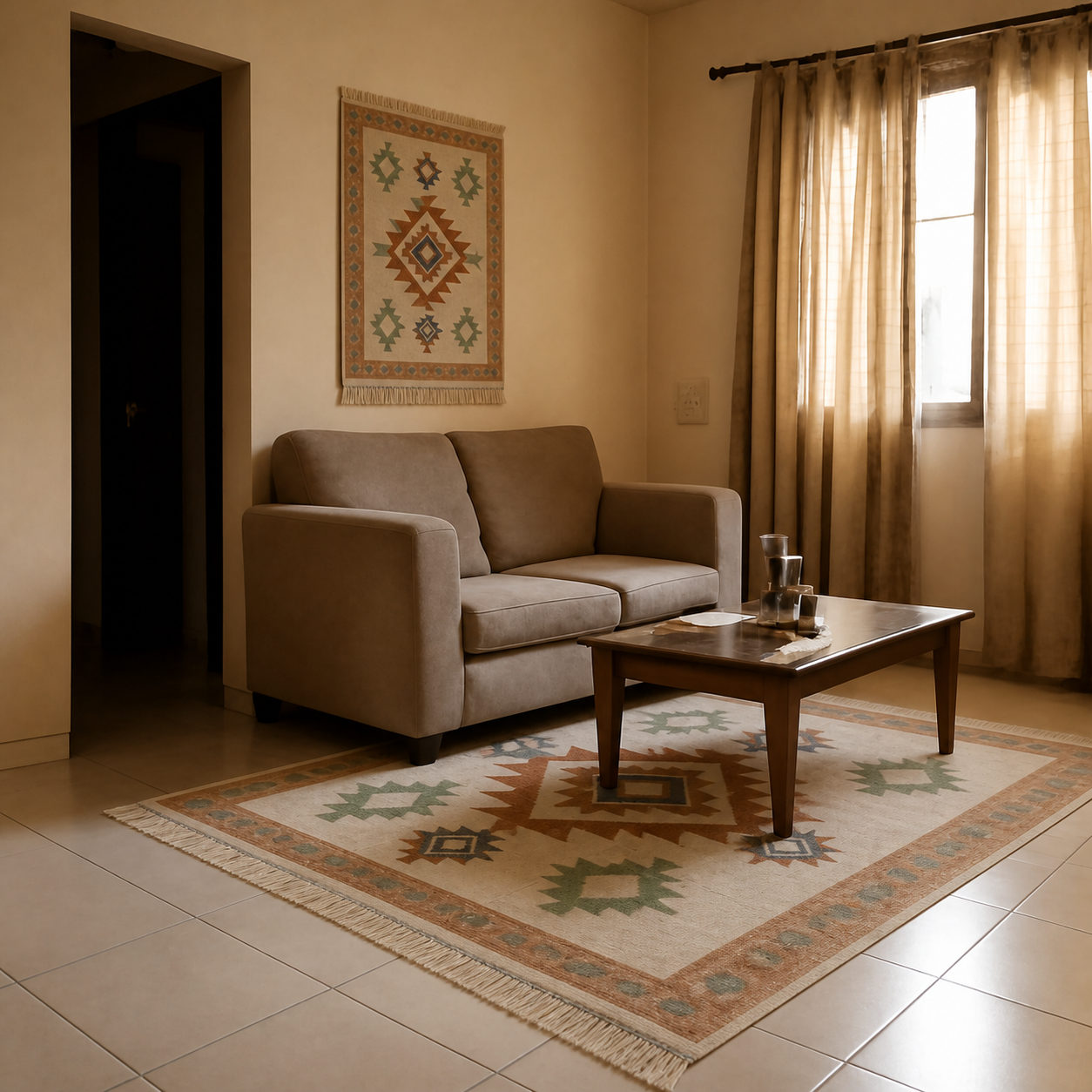
AI room visualizers are accurate enough on scale and lighting to make confident purchase decisions — when the tool composes a real product image into a real room photo. Photo-composition tools typically produce results within ~5–10% of true scale and match lighting direction correctly for most common room conditions. Generative tools (which create the image from a text prompt) are far less reliable for either dimension. The accuracy gap between these two approaches is the most important thing to understand.
Scale accuracy — what to expect
Scale in a preview is governed by how well the tool can map between the product's known dimensions and the room's perceived dimensions. Good tools use perspective cues — door frame heights, floor tile sizes, other furniture — to anchor scale. The typical results:
| Condition | Typical accuracy |
|---|---|
| Room photo has clear reference (doorway, existing sofa) | Within ~5% of true scale |
| Empty room, no obvious reference | Within ~10–15% |
| Close-up wall shot (no floor visible) | Can be off by 20%+ |
| Tilted or wide-angle photo | Unreliable |
For most real-world living-room photos with existing furniture visible, the preview is accurate enough that a sofa rendered oversized would be visibly oversized in the result. The exception is sparse, empty rooms — without perspective references, the tool is guessing.
Lighting accuracy
Lighting in a preview has two parts: direction (where shadows fall) and tone (warm vs cool). Photo-composition tools generally handle both well because the room photo carries its own lighting information, and the tool blends the product into that lighting.
- Direction. A daylight room with a window on the right produces a sofa preview with shadows falling to the left. Strong tools match this consistently. Weak tools have shadows that contradict the room's light source — an immediate visual giveaway.
- Tone. Warm afternoon light shifts everything in the room slightly golden. A grey sofa under that light reads warmer than it would under fluorescent. Good tools preserve this.
- Edge cases. Rooms with multiple competing light sources (a window plus two coloured table lamps plus a TV) can produce previews that look slightly off because the tool has to pick a dominant source. Daylight-only photos give the most reliable lighting results.
Where accuracy breaks down
- Mirror surfaces. If your room photo includes a large mirror, the reflection of the newly composed sofa won't be physically accurate. Tools generally don't solve the optics of reflected scale.
- Heavily textured rugs and fabrics. A patterned rug across the floor below the previewed sofa sometimes warps subtly. The preview is still useful for scale but the texture under the sofa may not look natural.
- Very small products. Tiny items like a small vase or a pet collar can lose detail when composed into a wider room photo. The preview gives you placement and scale, not the micro-detail of the item itself.
- Photos taken under coloured lighting. A room shot under bright pink or green ambient light will produce unusual results. Use daylight or neutral white-light photos when possible.
How to maximise preview accuracy
- 1Shoot the room in daylight. Natural light produces the most reliable shadows and colour.
- 2Stand back. A wider photo with the wall, floor, and at least one piece of existing furniture gives the tool more perspective references.
- 3Hold the phone level. Tilted photos throw off perspective.
- 4Use the product's main image, not a stylized lifestyle shot. The stylized one has its own background light that conflicts with yours.
- 5Generate two or three previews and compare. The tool's consistency between runs is itself a useful signal.
For deeper context on what previews catch and what they don't, see the realism guide. Or try one yourself — PlopIt is free, no signup.