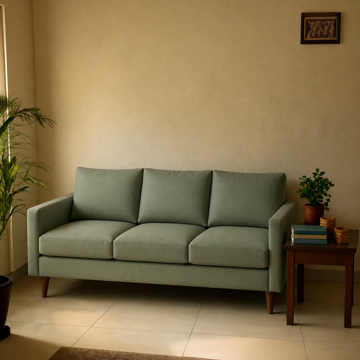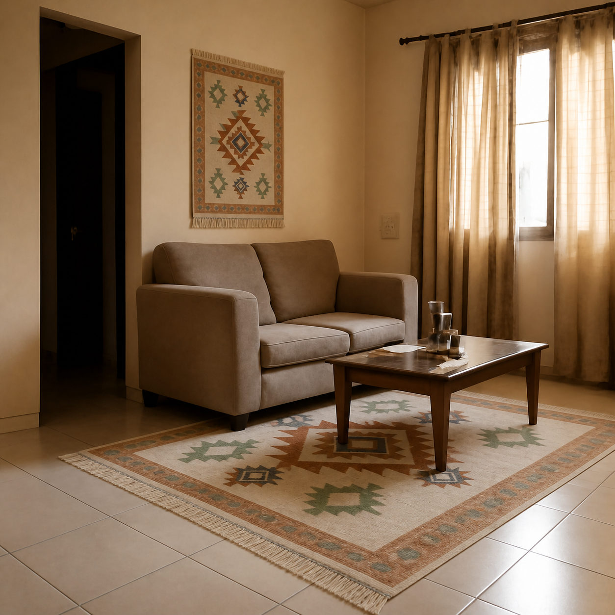
AI-generated room previews are realistic enough to make confident purchase decisions about furniture, rugs, lamps, and most home decor — but only when the underlying technology composes a real product image into a real room photo, rather than generating both from scratch. The distinction matters: a composed preview reflects what the actual product will look like; a fully generated render is closer to an artistic impression. Knowing the difference is the key to using these tools well.
What “realistic” actually means
Realism has three dimensions, and any preview can be evaluated against each:
- Product fidelity: does the previewed item match the actual product you would receive? (Same fabric pattern, same proportions, same colour variant.)
- Room fidelity: is the preview composed into your actual room, or a generic stand-in that resembles it?
- Physical accuracy: does the product sit at the right scale, with shadows and reflections that match the room's actual lighting?
The best AI previews score high on all three because they start from a real product image and your real room photo, then compose them together. The result feels “realistic” in the same way a good photo edit does — because it's a photo edit, just made faster.
Where AI previews are most accurate
- Scale. The preview shows you whether the piece is too big or too small for the wall — a check almost impossible from a product listing alone.
- Colour against your wall. A grey sofa against a cool-white wall and the same sofa against a warm-beige wall read very differently. The preview catches this.
- Lighting. Sofas photographed in studios look heavier in low-light rooms. Previewing in your room's actual light reveals this.
- Coordination. Whether the new piece visually fits with your existing furniture is something only an in-context preview can show.
Where AI previews fall short
- Texture detail. You can't feel the fabric through a screen. For high-touch items where the hand-feel matters (wool rugs, leather, velvet), order a fabric swatch in addition.
- Stairwell clearance. The preview shows the piece in place — it can't tell you whether delivery will actually get it there. Tape measure still required.
- Edge cases in lighting. Rooms with very unusual lighting (strong coloured lamps, neon accents, mirror-heavy spaces) can produce previews that look slightly off. Daylight room photos give the cleanest results.
- Small details on small items. Tiny products (jewellery, intricate carvings) sometimes lose fidelity when composed into a wider room photo. The preview gives you placement and scale, not micro-detail.
How to spot an unreliable preview
Quick checks to evaluate any preview tool:
- Does it show your room, or a stylized version of it? If walls, windows, or floor look different than your photo — the tool is regenerating, not composing.
- Does the previewed product match what you'll actually receive? Compare against the original product image — if the fabric pattern is “close but different,” the tool is approximating, not composing.
- Are shadows realistic? Light coming from the window should produce a shadow on the correct side of the sofa. Inverted or absent shadows are a red flag.
- Is scale plausible? A standard 84-inch sofa should look like a standard 84-inch sofa relative to a coffee table or doorway in the photo. Tools that hallucinate scale produce visually wrong (but pretty) results.
The honest verdict
For the question they're designed to answer — “does this product visually work in my space?” — AI previews are realistic enough to be the difference between a confident purchase and a return. They aren't a substitute for a tape measure or a fabric swatch, and shouldn't be used as one. They are the fastest, cheapest way to check the part of the decision that product listings cannot show you.
See the before/after comparisons on the demos gallery — every one is a real composition, not a render, with the source room photo and product image both visible.