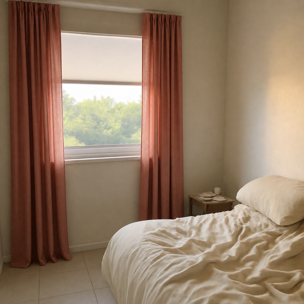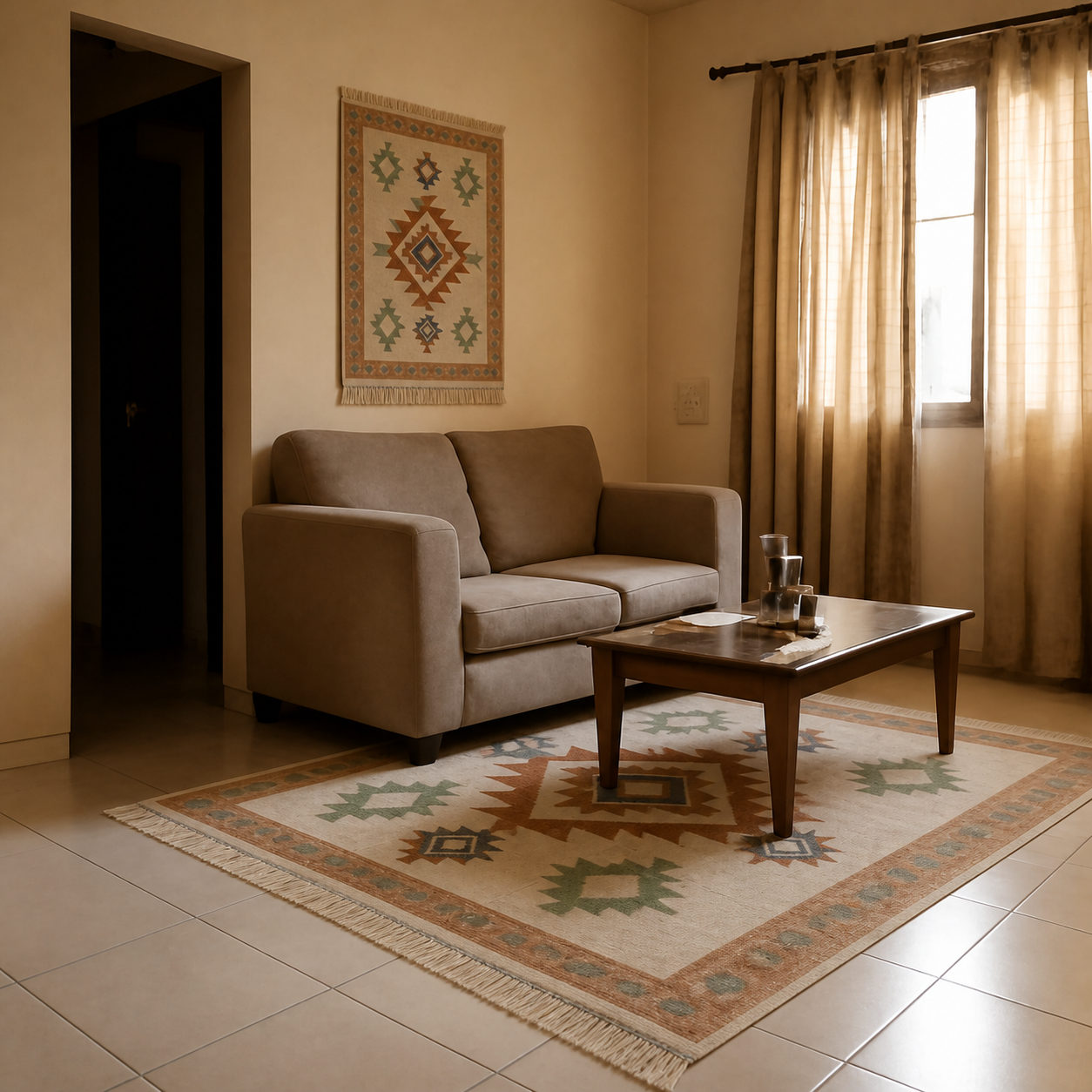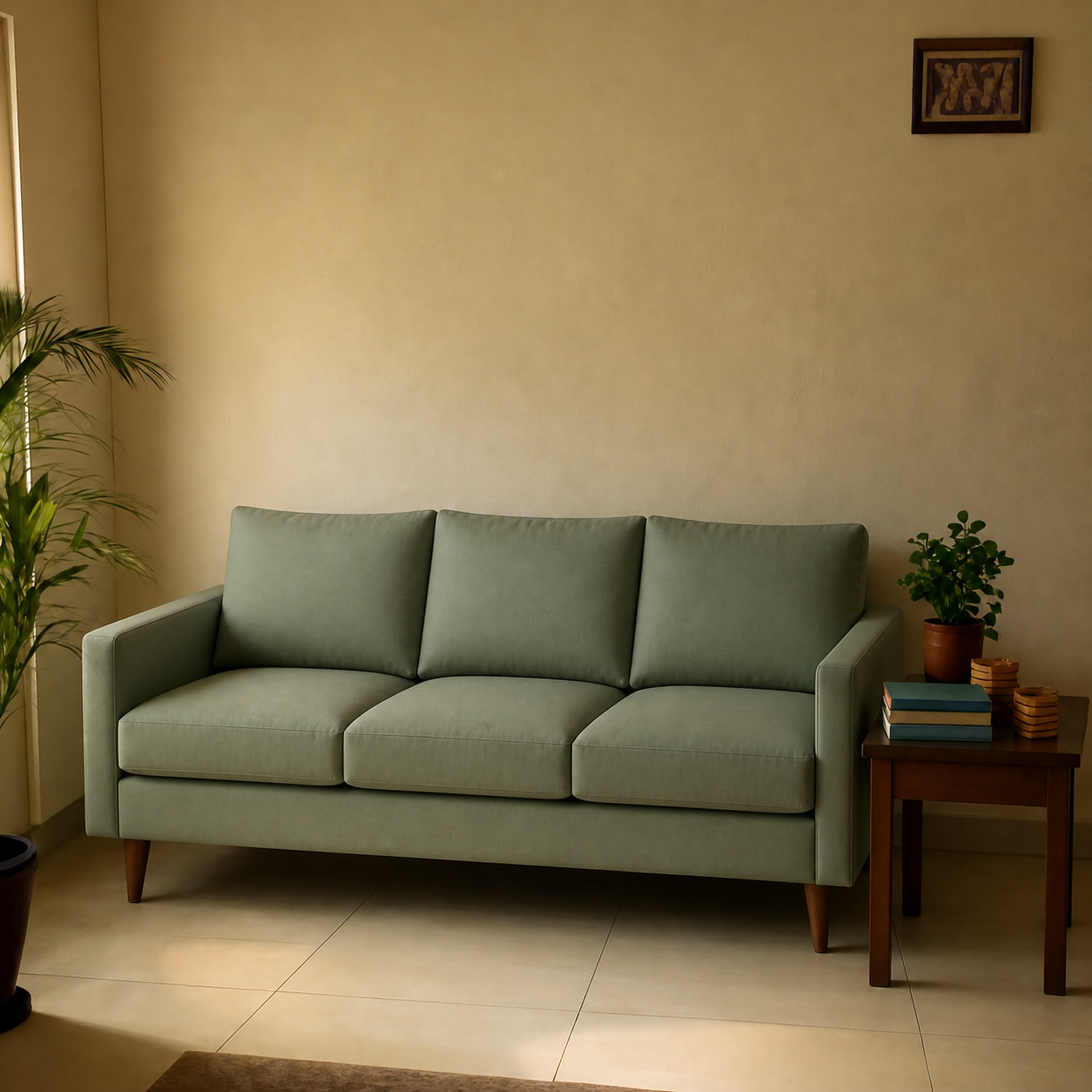
Yes — you can preview paint colours and wallpaper on a photo of your wall before you commit. The most reliable workflow combines two cheap steps: an AI visualizer to test five or six candidates digitally against your room's actual light, then a single physical sample of the winner painted onto a movable board. Skipping either step is how people end up with a fully painted wall they hate.
Why paint and wallpaper are uniquely high-stakes
Returning a wrong sofa is annoying but tractable. Returning a wrong paint job costs you the price of the paint, the labour to redo it, two days of fumes, and the original Sunday afternoon you sacrificed to the first coat. Wallpaper is worse — removal often damages the underlying drywall.
The decision is also harder than it looks. A swatch on the paint chip looks one way under the store's fluorescent ceiling light, another way against your warm bedroom lamp, and a third way at 3pm in direct sun. Wallpaper is harder still because repeat patterns scale up unpredictably from the sample.
The two-stage preview workflow
| Stage | What it answers | Cost |
|---|---|---|
| Digital preview | Does this colour read the way I want against my furniture? | Free |
| Sample patch | How does the colour shift under my actual light through a full day? | $5–$15 per sample |
| Full commit | The real thing | $200–$1,500 |
The digital step narrows a shortlist of fifteen candidates down to two or three. The physical sample picks the winner. Don't skip to physical samples for all fifteen — at $10 each, you'll spend more on tester pots than the eventual paint, and you'll burn weekends watching paint dry.
How a digital paint preview actually works
Good paint and wallpaper visualizers fall into the same composition bucket as room-furniture previewers — the AI takes a photo of your wall and a sample of the new finish, then composes the finish onto the wall while preserving the room's existing shadows, perspective, and lighting.
Three signs a paint visualizer is doing this properly:
- Shadow preservation. Where your wall already had a soft shadow from a lamp, that shadow stays — just translated onto the new colour.
- Texture retained. If your wall has a slight orange-peel texture, it should still be visible in the preview, not replaced by a flat fill.
- Light response. The side of the wall closer to the window should read brighter than the side in shadow — same as before the paint change.
Tools that fail these checks tend to flat-fill the wall with a single RGB value. The result looks more like a label than a painted surface, and it'll mislead you about how the colour actually reads in your light.
Key takeaway
A digital preview is only as good as the room photo you feed it. Shoot in even daylight, with the existing furniture in place, and turn off every lamp.
How to take a paint preview photo that doesn't lie
- 1Shoot between 10am and 2pm on an overcast day. Direct sun adds yellow; cloud light is neutral.
- 2Turn off every lamp and ceiling light. Indoor bulbs are warm and will skew the preview tone.
- 3Stand back enough to capture the full wall plus a strip of floor and ceiling. The room context helps the AI place shadows correctly.
- 4Hold the phone level — no tilt. Tilted walls produce keystoned previews that read oddly.
- 5Don't apply any filters. The phone's default HDR is fine; anything else changes the colour the AI sees.
The detailed photo guide is in how to take a good photo of your room.
How to swatch paint properly once you have a shortlist
After the digital preview narrows the candidates, the physical sample is the final check. Skip the “paint a square directly on the wall” advice — it traps you in two ways. If you don't end up using the colour, you have a patch to repaint. And the existing wall colour shows through the test patch and biases your read.
Better workflow:
- Buy two coats of paint onto a 2'×2' piece of foam board or thick poster paper.
- Tape one board onto each candidate wall — not just one wall. The same colour reads differently on the wall facing the window vs the wall opposite it.
- Leave the boards up for 48 hours. Check at 9am, noon, 4pm, and after dark with your usual lamps on.
- Compare against your sofa, your rug, and your largest piece of art — not against the bare wall.
Why wallpaper is trickier than paint
Wallpaper has three variables paint doesn't: pattern repeat, scale, and seam alignment. A sample swatch the size of a magazine cover gives you almost no information about how the pattern will read on a 9-foot wall. The same pattern can feel airy at a 2-inch repeat and oppressive at a 12-inch repeat.
A digital preview is the only practical way to see scale before you order rolls. Even an imperfect composition gives a useful first read on whether the pattern is too busy or too sparse. Combine it with a peel-and-stick A3 sample taped to the wall for the final check.
Common paint preview mistakes
- Testing under lamp light only. Indoor bulbs are warm (2700–3000K). They flatter warm colours and mute cool ones. Always check the preview against daylight.
- Ignoring the trim. The wall colour reads differently against bright white trim than against cream trim. Include trim in the room photo.
- Choosing colours next to other paint chips. A paint chip surrounded by darker chips looks lighter; the same chip in your house with no chips around it will look darker. The preview removes this bias.
- Skipping the rug and sofa. Wall colour is decided against the furniture, not in isolation. Always preview with the existing pieces in frame. The same logic for picking rugs is in how to choose a rug for your living room.
- Testing too many candidates. More than six options creates decision fatigue. Use the digital preview to cull aggressively before you spend on samples.
Where digital previews are most and least accurate
- Most accurate: matte and eggshell finishes on flat walls in daylight.
- Mostly accurate: satin finishes, lightly textured walls.
- Least accurate: high-gloss finishes (reflections are hard to model) and rough textured walls (the AI smooths them out).
See more on this trade-off in are AI room previews realistic.
Pair the preview with the surrounding decor
Once the wall colour is settled, the same compose-then-sample workflow applies to curtains, mirrors, and floor and pendant lamps. The new wall colour shifts how every piece reads. Compose them together before you buy anything else.
For a quick before/after on how a coloured wall changes the rest of a room, see the curtains bedroom demo.