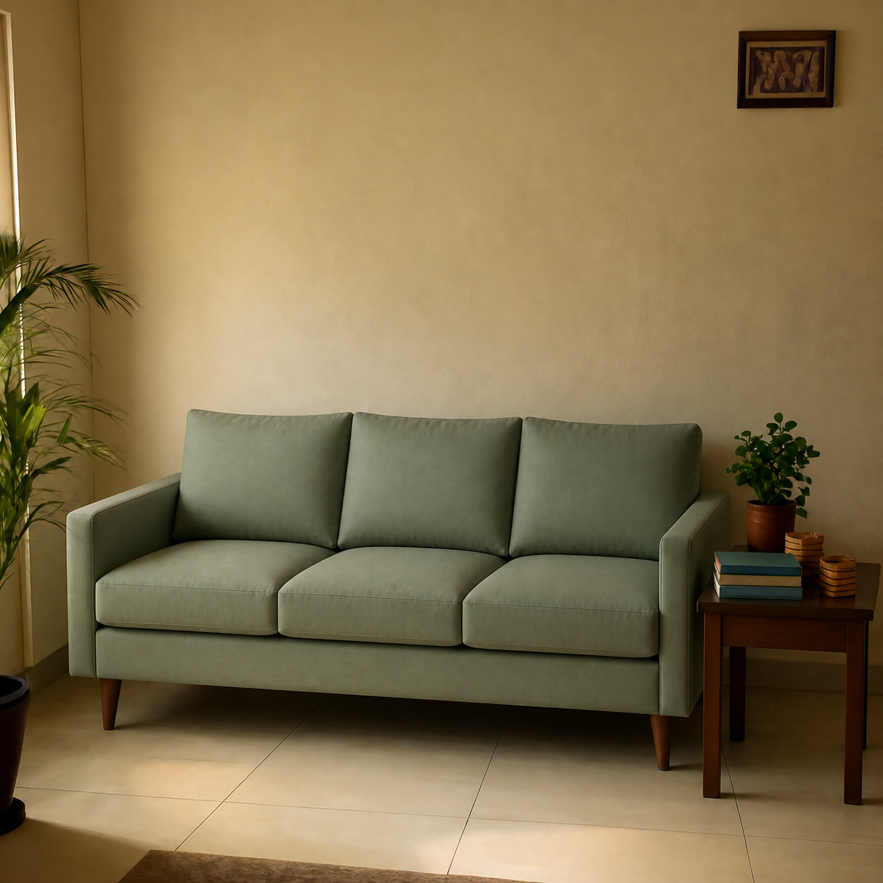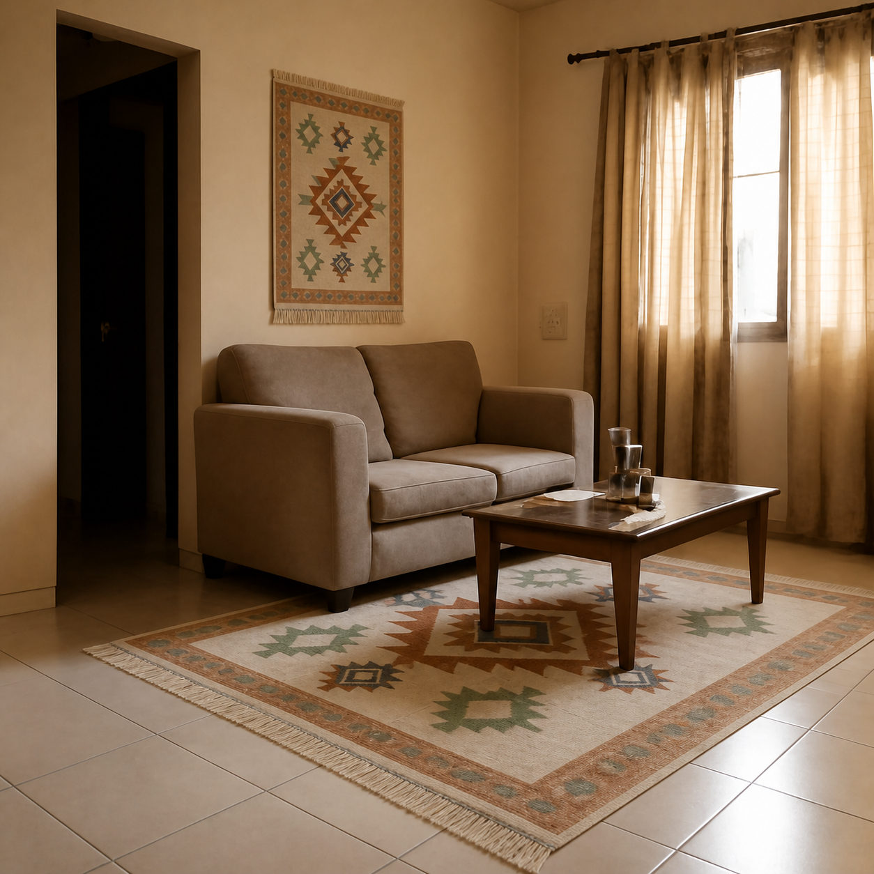
When AI room previews look fake, it's almost always one of five specific tells: shadows on the wrong side of the product, a regenerated room that no longer matches your photo, scale that a doorway would betray, oversaturated colour that doesn't match the room's light, and edge artefacts where the composited product was pasted in. Learn to spot these and you can sort reliable preview tools from the artistic-render category in under a minute.
Tell 1 — Shadows fall the wrong way
Every room has a dominant light source — a window, an overhead fixture, the brightest lamp. Everything in the room casts its shadow on the side facing away from that light. A composited product must obey the same rule, or the brain knows it's fake instantly even before it can say why.
Common shadow failures:
- The window's on the left, the existing chair's shadow leans right, but the new sofa's shadow leans left. Inverted.
- The product floats — no contact shadow at all where it touches the floor. This is the rejected-by-the-eye giveaway.
- The shadow is the product's perfect silhouette pasted on the floor at a 45° tilt — too sharp, no falloff, like a cardboard cutout.
Verdict in three seconds: compare the new product's shadow to any existing object's shadow in the same photo. They should lean the same way and fade with similar softness.
Tell 2 — Your room got regenerated
The most damaging failure mode, because it's the easiest to miss. A weaker tool, asked to add a sofa to your room photo, will redraw the whole image — your wall paint shifts a hue, your coffee table changes shape, the window frame moves an inch left. Everything looks reasonable in isolation; nothing matches your actual room.
| Element | Composed preview | Regenerated render |
|---|---|---|
| Wall paint | Pixel-identical to your photo | Same family, slightly different |
| Existing furniture | Unchanged | Subtly redrawn — different legs, edges |
| Window placement | Same coordinates | Shifted by inches |
| Outlet and switch positions | Unchanged | Missing or moved |
The fastest test: zoom in on a fixed reference — a power outlet, a doorway hinge, a corner of a picture frame — and compare to your original photo. If anything is different, the tool is regenerating, not composing.
Tell 3 — Scale that's hallucinated
An 84-inch sofa is roughly the height of a doorframe lying on its side. If the previewed sofa is half the width of the doorway, or the same height as the coffee table's tabletop, the composition got scale wrong.
Scale errors come from two sources:
- No camera geometry model. The AI doesn't know the camera's focal length or its distance from the wall, so it guesses.
- No product size data. An 84-inch sofa and a 60-inch sofa look identical to a model that doesn't read the listing's dimensions.
Sanity-check by comparing the previewed product to a known object in the frame: a doorway is roughly 80 inches tall, an outlet plate is 4.5 inches, a coffee table is 18 inches high. If the sofa back is the same height as the doorway, it's too tall; if the sofa is shorter than the coffee table, it's too short.
Key takeaway
One fixed reference in the frame — a doorway, an outlet, an existing chair — turns “does the scale look right” from a feeling into a measurement.
Tell 4 — Colour that's too saturated
Studio product photography uses bright, neutral lights to make colours pop. Your living room doesn't. When a tool composes a product into your room but keeps the studio saturation, the result reads as “sticker on a photo” — too vibrant against everything else.
A faithful composition desaturates the product slightly to match the room's light temperature. A teal sofa under warm 2700K bulbs should read slightly muted and warmer than the catalogue shot. If the previewed sofa is the same eye-popping teal as the product image, the tool didn't do the colour-grading step.
Tell 5 — Edge artefacts and seam halos
Older composition pipelines paste the product as a rectangular layer and try to feather the edge. The result is a faint halo or a slightly soft edge where the product meets the floor or wall. It's subtle — the kind of thing you spot only on a phone screen at close range — but it's the most reliable cue your eyes pick up unconsciously.
Modern composition models avoid this by re-rendering the contact zone — the bottom edge of a sofa where it touches the floor, the underside of a rug where shadow falls, the rim of a lamp shade against the wall. If you zoom into that contact zone and see unnatural smoothing, the tool is older or cheaper than it claims.
The 30-second authenticity check
- 1Open the original room photo and the preview side by side.
- 2Pick one fixed reference — a doorway, an outlet, a corner of an existing piece. Confirm it's pixel-identical in both.
- 3Check shadow direction. New product's shadow should lean the same way as everything else in the room.
- 4Zoom to the contact zone (where product meets floor or wall). Look for halos or unnatural smoothing.
- 5Compare product colour to the catalogue image. Should be slightly desaturated to match the room's light, not identical.
Why some tools score on all five and others on none
The deciding factor isn't the underlying AI model — many tools use similar underlying models. It's the pipeline around the model: whether the room is preserved as a fixed reference, whether the product's pattern is locked, whether shadows and colour temperature are computed as separate passes rather than left to the model's default behaviour.
Tools that get all five right are doing more engineering on either side of the model than they advertise. Tools that fail most of these tests are using an off-the-shelf image-edit endpoint with no constraint layer.
Where your room photo helps or hurts
- Helps: daylight, wide angle (the full wall and a strip of floor), phone held level.
- Hurts: harsh single lamp at night, extreme tilt, narrow crops that don't show context, mirror-heavy spaces.
- Catastrophic: phone tilted 30° so the walls converge to a point — keystone distortion the AI can't fully correct.
For the photo guide, see how to take a good photo of your room for an AI visualizer.
Sanity-check against a known-good demo
Run the five checks on a public before/after that's already out in the wild — every demo on the sofa living room and rug living room pages publishes both the original room and the composed result. Use them as calibration: a tool that produces previews indistinguishable from those passes; one that doesn't, fails.
And for the deeper question of how realistic the technology is in general, see are AI room previews realistic and how accurate are AI visualizers for scale and lighting.
The honest verdict
AI room previews look fake when the pipeline cuts corners — regenerating the room instead of preserving it, skipping the colour-grade pass, leaving shadows to the model's default. Look fake on a phone screen and they'll feel wrong in person too. Spend the thirty seconds running the five checks before you trust a preview enough to spend money on the result.