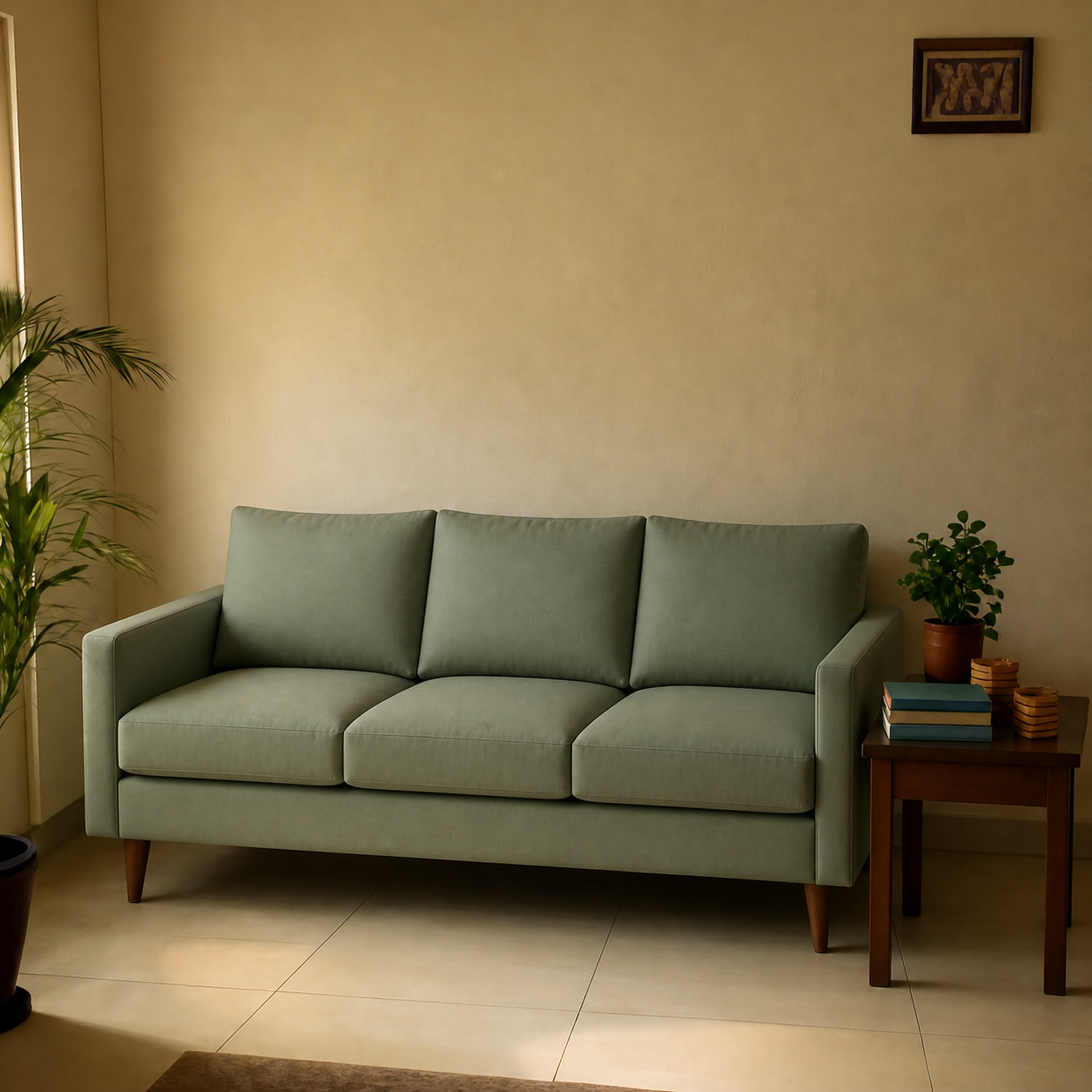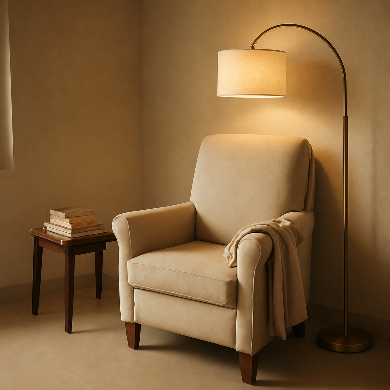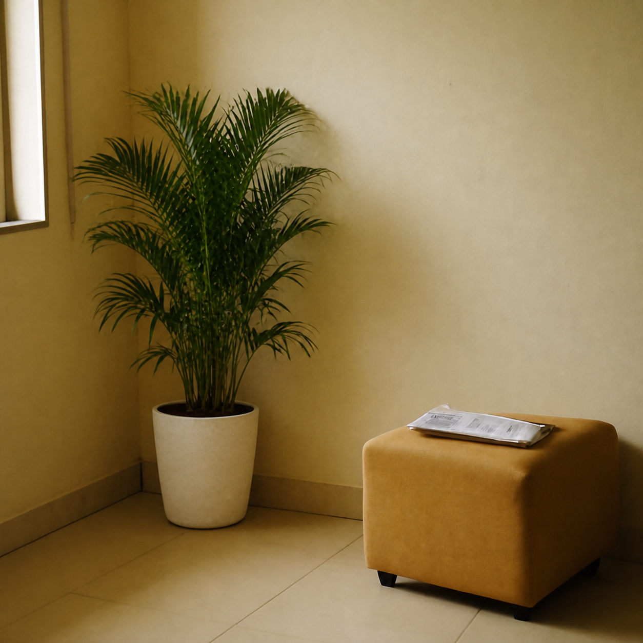
A new piece of furniture matches your existing decor when it echoes at least one thing already in the room — a wood tone, a metal finish, a fabric weave, or a shape line. You don't need everything to match; you need one deliberate repeat. The fastest way to fail at this is to buy in isolation: a chair that looked perfect in the listing photo sits next to your sofa and quietly clashes. The fix is a five-minute audit before you buy, plus a photo preview of the piece in the actual room.
The echo principle — why one repeat fixes most clashes
Rooms feel coordinated when the eye finds a familiar element in every new piece. A black metal floor lamp works in a room full of warm wood if there's already black somewhere — a TV frame, a window sash, a picture frame. The same lamp lands wrong in a room with only brass and brown, because nothing repeats.
Before buying anything, ask one question: does this new piece share at least one of (wood tone, metal finish, fabric texture, shape language) with two existing pieces in the same room?If yes, it'll harmonise. If no, it'll fight.
Wood-tone matching — the first thing the eye reads
Wood tones are the most-noticed mismatch in a room. There are roughly five families, and the rule is to stay inside two adjacent families per room — not five.
| Family | Common woods | Plays well with |
|---|---|---|
| Cool light | Ash, white oak, maple | Cool mid, painted whites |
| Warm light | Pine, rubberwood, birch | Warm mid, cane, rattan |
| Cool mid | Walnut (grey-cast), grey oak | Cool light, black metal |
| Warm mid | Teak, sheesham, cherry | Warm light, brass, leather |
| Dark | Mahogany, ebony, dark walnut | Warm mid (sparingly), black metal |
Mixing cool light with dark warm (white oak floor + mahogany cabinet) is the most-googled wood-clash pattern. It can work, but only with a bridging piece — a mid-tone rug, a fabric chair, or a leather sofa that splits the difference.
Metal finishes — pick two, not three
Two metal finishes per room reads intentional. Three reads cluttered; four reads accidental. The pairings that work:
- Brass + black — the most forgiving pairing; works in nearly any palette.
- Brushed nickel + matte black — the modern-neutral default.
- Antique brass + bronze — warm-toned rooms; rich, lower contrast.
- Chrome + black — a cooler-toned, more minimalist pairing.
Within a single fixture or piece, stick to one finish. The mixed-metals trick works at the room level, not at the object level.
Fabric textures — contrast is the goal, not match
Three identical fabrics make a room feel flat. The fix is to vary texture while keeping the colour family tight. A linen sofa, a velvet armchair, and a wool rug in the same beige-grey family will read as one coordinated room. Three velvet pieces in the same colour will read as a showroom.
- One smooth fabric (cotton, linen, leather).
- One pile fabric (velvet, chenille, boucle).
- One natural fibre (jute, sisal, cane, rattan).
Scale consistency — the silent killer
A new piece can match every colour and finish and still feel wrong if the proportions are off. Scale failures are the hardest to fix because they only show up once the piece is in the room.
The rough rules:
- Accent chair seat height should be within 2 inches of the sofa seat height.
- Coffee table height should be within 1-2 inches of the sofa seat height.
- Side tables should match the arm height of the sofa, give or take 2 inches.
- Pendant lights hang 30-36 inches above a dining table, regardless of ceiling height.
For a deeper accent-chair sizing walk-through, see how to check if an accent chair fits the scale of your room — chairs are the single piece scale most often gets wrong.
Shape language — straight lines vs curves
Rooms that read “designer” almost always mix one strong shape language with one contrasting accent. A room of straight lines and right angles benefits from one curved piece — an arch mirror, a round side table, a curved-back chair. A room of round and curved pieces benefits from one strong rectangle.
If everything is rectilinear, the room reads heavy. If everything is curved, it reads cartoonish. The 80/20 split — eighty percent of one shape language, twenty percent of the other — is the easiest-to-replicate version of this principle.
The five-minute audit before you buy
- 1Stand in the room and write down the two wood families, the one or two metal finishes, and the three dominant fabric textures already in the room.
- 2Pull up the listing for the piece you're considering. Does it share at least one family with what's already there?
- 3Check the listed dimensions against the scale rules above (seat height, table height, depth).
- 4Look at the shape — does the room need this much rectangle, or does it actually want a curve?
- 5Preview the piece in a photo of the actual room — colour against your wall paint is the part nobody guesses correctly.
Why the photo preview catches what the audit doesn't
Listing photos are shot in lit studios with neutral walls. The same chair on your wall — under your bulbs, against your paint, next to your existing sofa — can shift two full tones warmer or cooler. Wood that read warm-mid in the studio reads orange against a cool-grey wall.
Drop the product image into a room visualizer with the actual room in the background and the question of harmony is no longer a guess. See a sofa placed into a living room for an example of how a photo preview reads, or browse the sofa category for more setups.
Common matching mistakes
- Buying a set to be safe. A matching three-piece sofa-and-chairs set reads like a showroom, not a home. Echo, don't match.
- Mixing five wood tones. Two adjacent families. Three at most. Five is chaos.
- Trusting the listing colour name. “Walnut” from one brand and “walnut” from another can be two different families. Eyeball the photo, ignore the name.
- Skipping the visual check. Even with a perfect audit, the only way to know how a new piece reads in your light is to preview it in a photo of your room before ordering.
Quick checklist
- 1Identify the two wood families and two metal finishes already in the room.
- 2Pick new pieces that echo at least one element of the existing palette.
- 3Vary fabric textures, not colours, to add depth.
- 4Run the scale check — seat heights, table heights, pendant drops.
- 5Preview the piece in a photo of your actual room before paying.